Design system overhaul
Warby Parker’s new design system unifies and uplifts visual and functional experiences across the entire digital ecosystem.
Brief
1/3
Unify the system and streamline process at scale
When I joined, 3 disparate, platform-specific design systems existed causing design inconsistencies. I took action to build 1 system for all platforms to streamline process, promote consistent experiences and empower designers to innovate the system with speed.
Role
Lead System Designer
What I did
System design
UI/UX
Motion
Platforms
Web
iOS
Android
Business systems
Solution
2/3
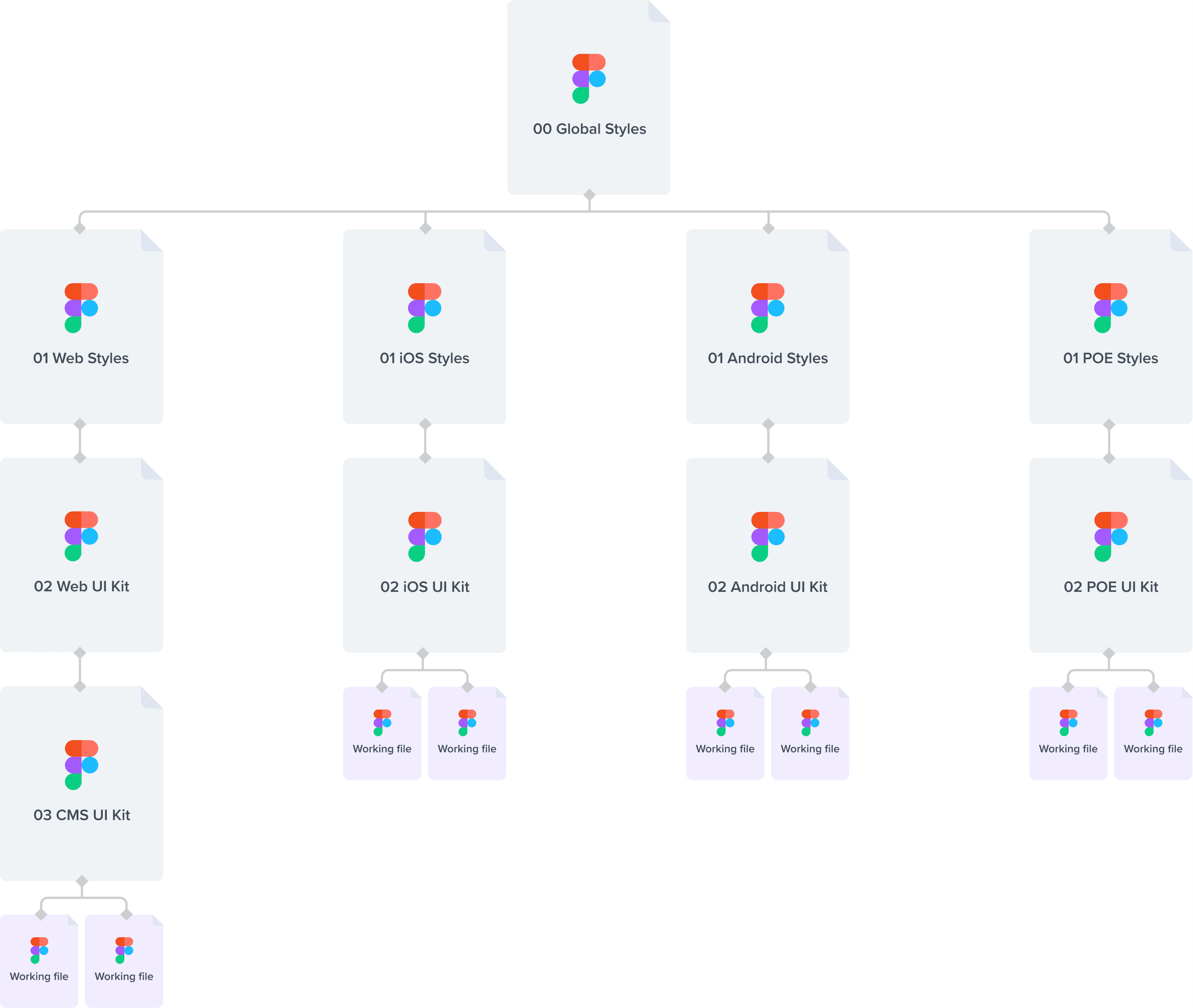
00 Global styles
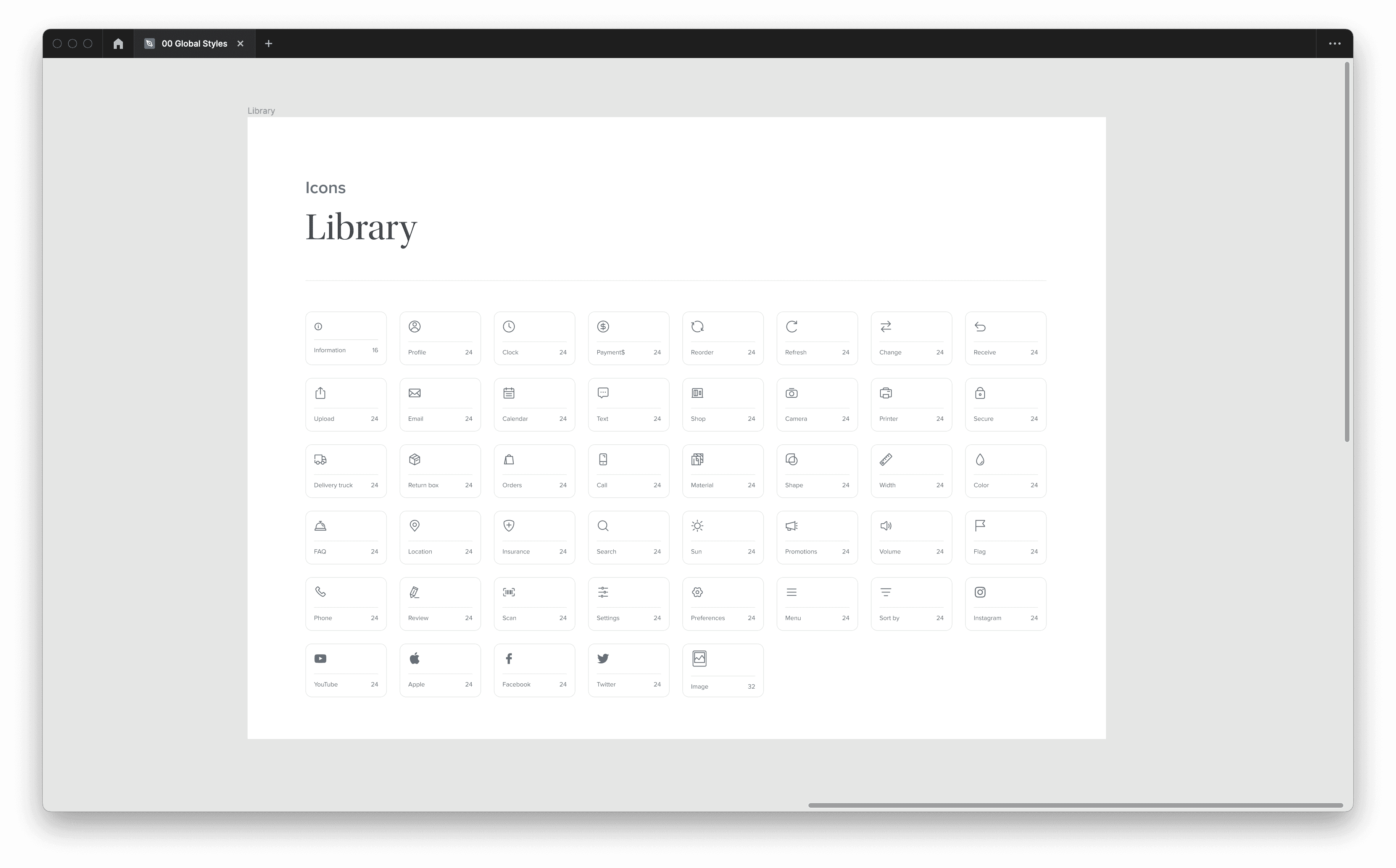
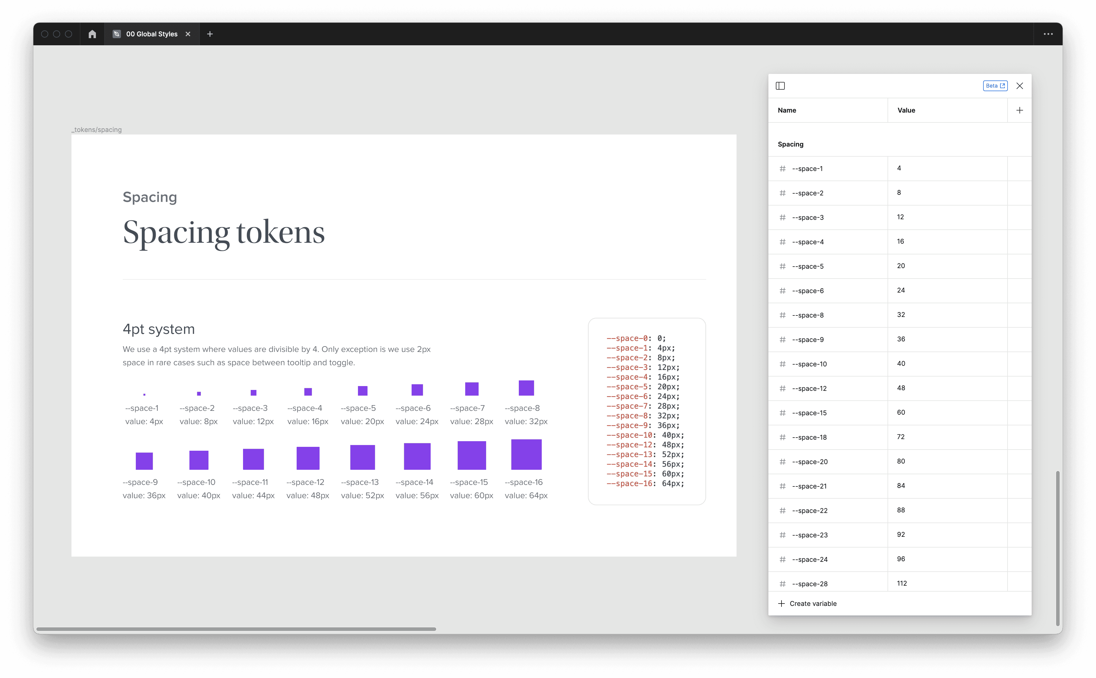
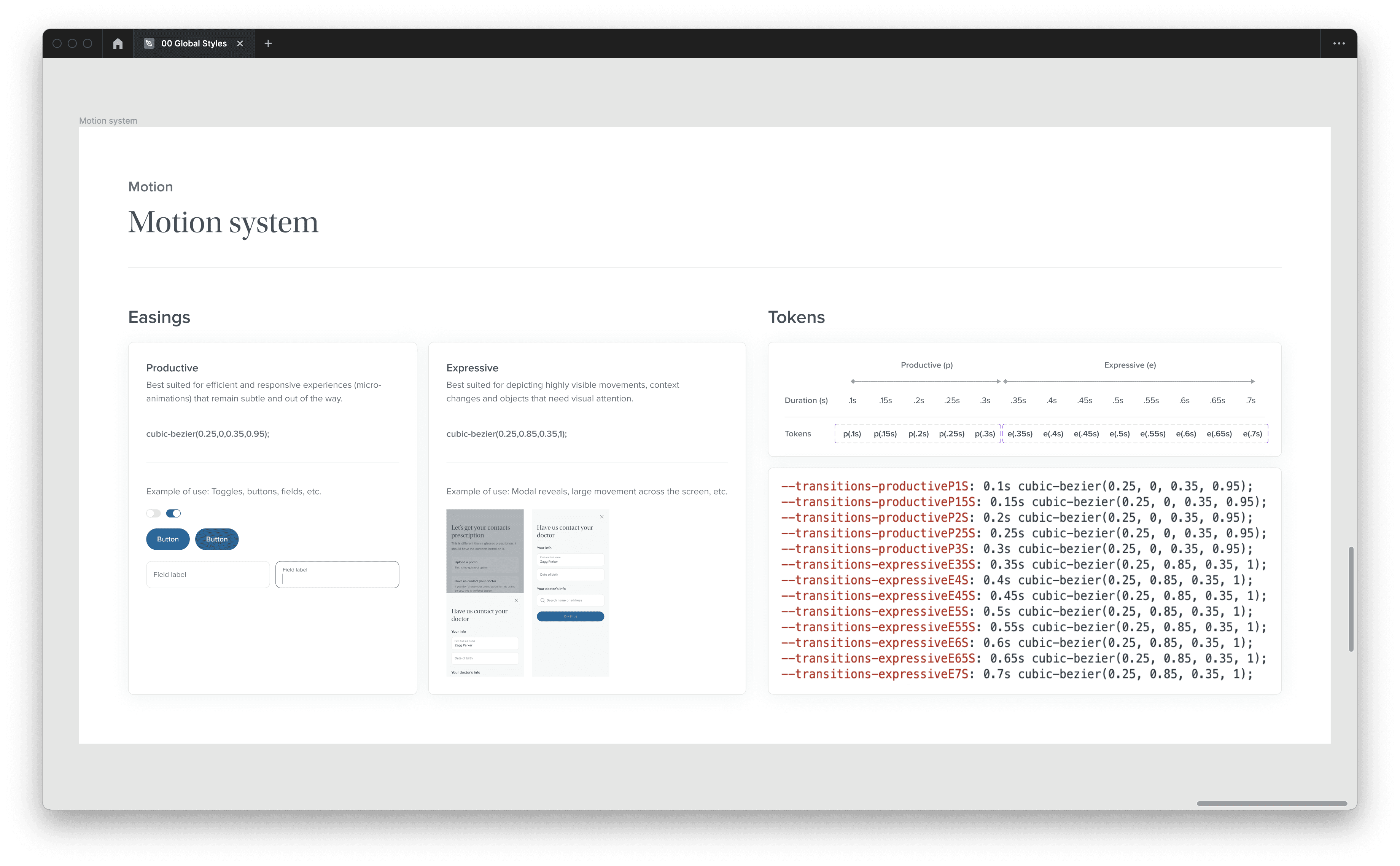
At the highest level, all platforms (Web, iOS, Android and business systems) share styles that include colors, icons, motion and more for consistency and speed at which a style is updated cross-platform.

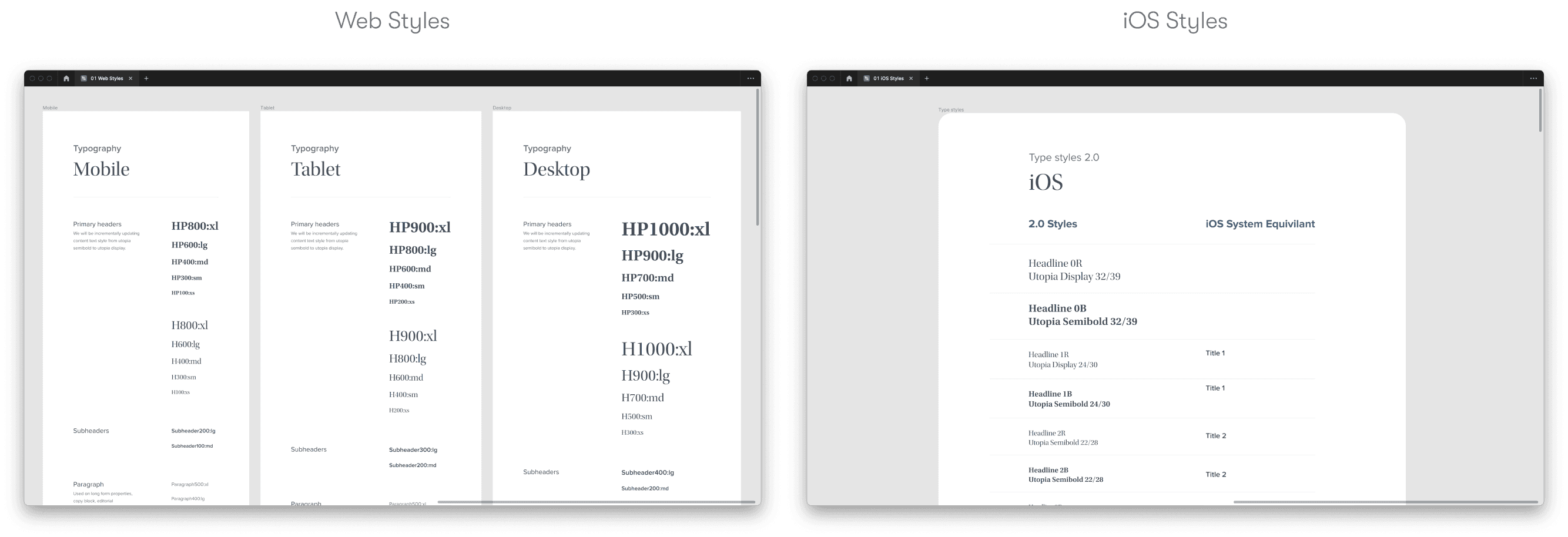
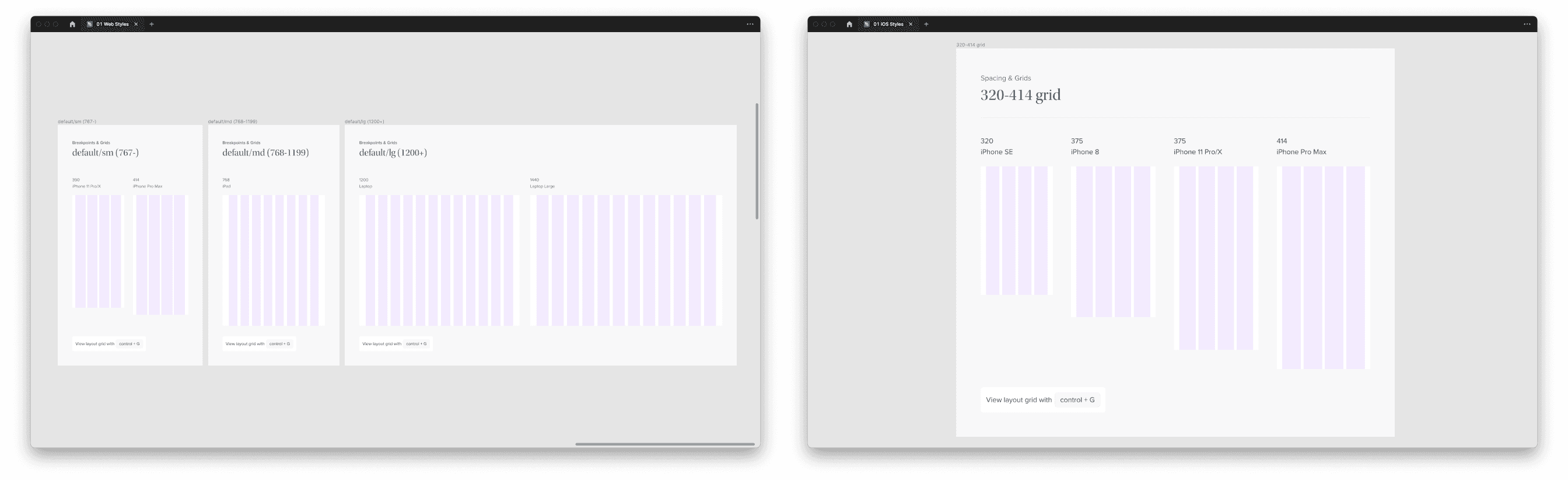
01 Platform-Specific Styles
While inheriting global styles, these libraries (Web Styles, iOS Styles, etc) diverge into platform-specific paths that hone in on shared typeface, grid, shadows and more.
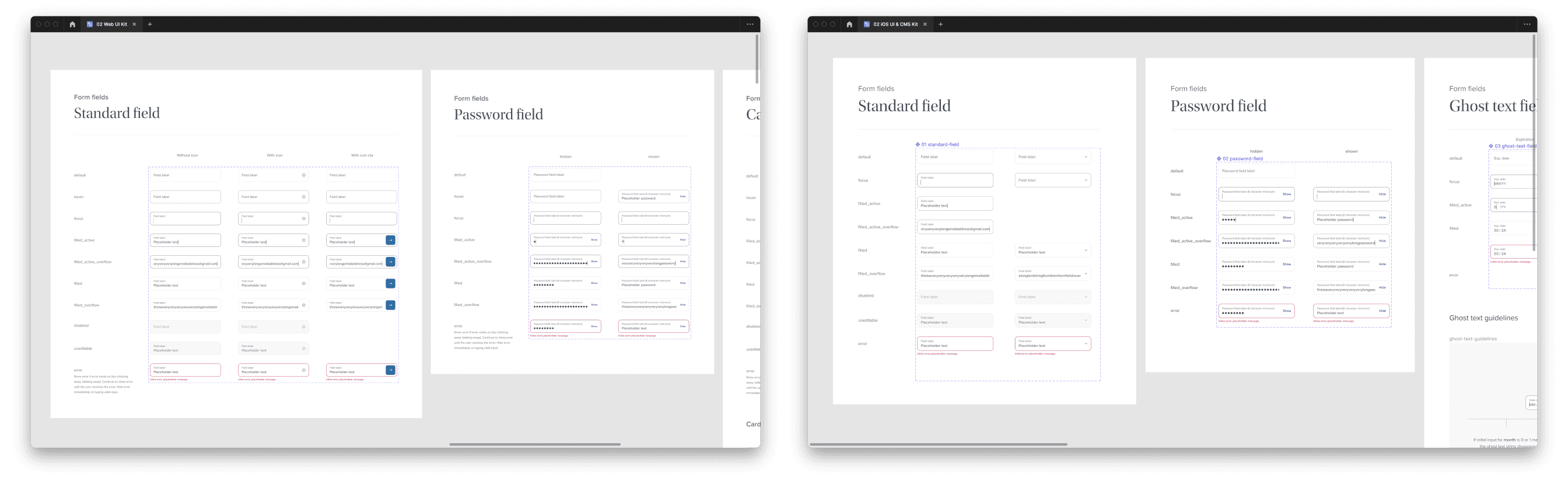
02 Platform-Specific UI Kit
While inheriting global and platform-specific styles, the UI kit is the most utilized file containing components used to help build experiences.


Results
3/3
Unified
experiences with shared elements cross-platform
Flexible
component library for easy adaptability
Premium
visual and functional components that welcomes new ideation
Quick call-out — The objective wasn’t to build the best and final Warby Parker design system. I acknowledged the ongoing future evolution of our products and the need for the design system to be more flexible rather than to restrict the engineering process or new creative ideas.